Cooper Smith & Company Brand Reboot

We recently shared the five key questions we ask clients who want to rebrand. From evaluating your market and market position to ensuring your logo is flexible enough to meet changing media demands, there are lots of factors to consider before confidently moving in the direction of a rebrand. And it’s not a decision to be made lightly! Hiring a professional agency to conduct an in-depth brand study, then guide you through the identity development process is an investment. Plus, you’ll need to nail the roll out of the new brand, which is another major cost. You’ll replace uniforms, building signage, print collateral, your website, and all other assets where your logo is present.

Clearly, we understand the magnitude of such a shift, and know the importance of a well-executed rebrand.

So, how did we know it was time to turn our attention to our OWN brand? This year marks our 25th anniversary, which is a natural time to pause, to evaluate what’s working well, and to make refinements. We certainly didn’t enter the branding process thinking “Our logo is horrible! We need something new!” But we did say “We’ve had the same look for quick awhile. Let’s do a persona study to make sure we’re projecting an image that matches our brand today.”

We ended up with an identity system that is the fresh, fun and modern, and lends itself to animation and movement. Our bright color palette speaks to the energy and creativity of our team. Overall, we are thrilled with our rebrand, and excited to continue to evolve as our business changes!



Cooper Smith & Company Brand Reboot2018-05-21T15:55:40+00:00

Meet the Artist: Will Bassett

As a 2016 graduate of the Iowa State University College of Design, Will Bassett is the newest member of our design team. He has quickly become an integral member of our agency, working closely with clients to deliver hardworking print & digital communications.

What’s your favorite color palette to work with?

I’m not sure there is a specific color palette that I enjoy over others. I would say in general, my favorite palettes include black and white, plus some soft, natural colors with a powerful, vibrant spot color. I love design that pops, and it usually starts with a strong spot color. If I had to choose, I’d say reds and blues are my favorite to work with, though depending on the day it could be something completely different. It really depends on the project and which side of the bed I woke up on.

What is your favorite typeface and why?

My favorite typeface is probably Futura. I love how simple yet versatile it is. It works when it’s thin, and it works when it’s bold. Futura makes a great headline typeface, body copy, all caps, or upper and lower case. It’s absolutely one of my go-to’s.


For a serif typeface, I really enjoy Bodoni. It’s super clean, and the contrasting thin and thick lines make it a beautiful choice when I need a more formal option.

Where do you find design inspiration?

My favorite place to find inspiration is on Behance. It’s a great place to see what designers are doing all over the world. From small, personal projects to corporate branding and major promotions, I think Behance is a wonderful source of inspiration and trends.

Another great place for inspiration and design knowledge is Skillshare. Skillshare is a site where anyone can become a teacher and post tutorials, how-to’s, and technique videos for others to learn from. The site has videos on everything from cooking to technology to business, but the design videos are extremely informative and helpful. There are some really well-known designers who post tutorials on Skillshare like Paula Scher, Aaron Draplin, and more. I highly recommend checking it out!

Tell us about your most memorable project.

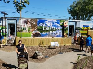
I think my most memorable project would have to be a semi trailer wrap that I did for the Iowa DNR’s mobile exhibit. It is certainly the largest project I’ve done in my career so far. Every day I am learning new things, and this was one of the largest learning curves I’ve had as far as scope and technicality.

The trailer exhibit debuted at the Iowa State Fair and travels around to schools and educational events around Iowa to inform the public of the impact of how we live on the environment. I believe that the best design is design for good, and getting the opportunity to create something with so much public impact was incredible. It’s always fun to see something you’ve done out in the world, especially with so many people interacting with it at a place as iconic as the State Fair.

Who are your favorite artists or designers?

One of my favorite design groups out there today is DKNG Studios. DKNG is an illustration-based design firm out of LA consisting of two designers, Dan Kuhlken and Nathan Goldman. I was turned on to them in college, and have been borderline obsessed ever since. They do a lot of promotional work for movies, bands and festivals, and their designs are both intricate and beautiful. These guys are also very involved with Skillshare and are regularly posting tutorials on Adobe Illustrator shortcuts and techniques.

A local designer that I really admire is John Bosley. He is also an illustration-based designer who does mostly screen printing for events and locations around Iowa and the Midwest. His designs are super clean and the compositions are brilliant. A few of his posters may or may not be on my Christmas list this year.

What are your favorite well-executed brands?

In my opinion, Nike is one of the most well-executed brands out there today. They do a great job of appealing to about every demographic while keeping their look and brand consistent and recognizable. You can’t go anywhere without seeing that swoosh, and people (myself included) will certainly pay extra to have that logo on their outfit.

Apple is an easy answer, but I have to say I wasn’t an Apple convert until a few years ago. I used to try to fight the overwhelming Mac/iPhone trend until I visited my dad’s cousin’s house/design studio. He opened up a Power Mac G5 computer so that I could see the inner workings, and it was beautiful. The inside of this computer (that most people would never take the time to look at) was a work of art on its own. Everything had a place. Since then, I’ve been fascinated by the clean design and order that Apple prides itself on. I didn’t even want to throw away my MacBook or iPhone boxes because the packaging is so well done. That attention to detail and presentation goes a long way in selling and building brands, and Apple is probably the best there is at it.

Meet the Artist: Will Bassett2018-05-07T21:44:23+00:00

The Story Behind Our Digital Postcards

Almost one year ago, we launched our Post-O-Grams. We created these postcards to be easy to digest – usually less than 100 words, plus a cool “postcard” image and corresponding stamp.

In developing Post-O-Grams, we had three main goals:

#1.) Be a resource.

With nearly 25 years in business we’ve gained experience in virtually every aspect of marketing and communication. We’re always sharing our learning, tips and hints with clients, and we thought subscribers would benefit from it, too. So far, they love the Post-O-Grams!

#2.) Develop relationships with new contacts.

Sally attends tons of events in the community. Post-O-Grams are a great way to keep in contact with the people she meets.

#3.) Teach subscribers more about what we do.

Our agency is well known for our design work, but even existing clients are sometimes surprised to learn about the business strategy and consulting services we offer.

We’ve been very happy with the response to our Post-O-Grams! Sally regularly gets compliments from subscribers about how interesting and engaging the content is, and we’ve had a handful of people ask if we can create a “Post-O-Gram” spinoff for their company or brand.

Our most popular emails of the year were both animated, and featured seasonal content:

Halloween Pest-O-Gram – We used a GIF for our “Pest-O-Gram” Halloween takeover, featuring a creepy crawly spider.

Shiny Brite Christmas – We love vintage packaging, so when Doug found a box of ornaments in his family’s basement, we couldn’t resist some Christmas fun.

Not on our Post-O-Gram list yet? Click here to sign up.

The Story Behind Our Digital Postcards2018-05-07T21:24:55+00:00
Go to Top